Josef Albers
German, 1888-1976 (active USA)
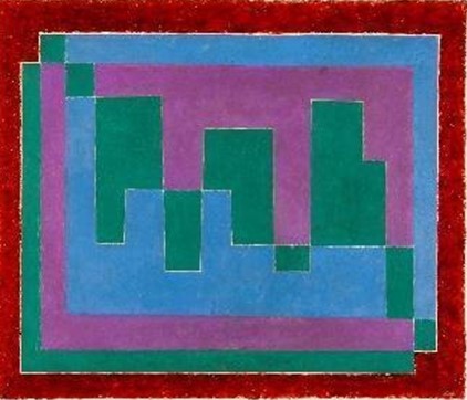
Mirage (A), 1940
Oil on pulp board
28 x 31 7/8 in.
SBMA, Museum purchase for the Donald Bear Memorial Collection
1967.24

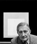
Josef Albers. Yale University, 1955-56. Photo: John Cohen.
“Color is the most relative medium in art.” - Josef Albers
RESEARCH PAPER
Josef Albers’s "Mirage (A)" stands as a compelling example of his mastery in geometric abstraction and his deep investigation into the interaction of color and form.
The work is characterized by squares of varying colors and sizes, creating an illusion of spatial ambiguity. Albers’s deliberate use of color is paramount; he juxtaposes hues to explore the phenomenon of color relativity. The colors – red, blue, green, and pink – seem to vibrate or shift depending on their placement and proximity, challenging the viewer’s perception. As Albers himself wrote, "In visual perception, a color is almost never seen as it really is — as it physically is. This fact makes color the most relative medium in art" (Albers, p.10). The lines are crisp, and the edges of each square are meticulously delineated, emphasizing the flatness of the medium while simultaneously creating a sense of three-dimensionality. The texture is smooth and devoid of visible brushstrokes, further highlighting the purity of color and form.
Albers’ technique involved applying layers of paint with a palette knife, ensuring even coverage and eliminating evidence of the artist’s hand. This method underscores his focus on the interaction of colors rather than the process of their application.
"Mirage (A)" falls within the broader movement of modernist abstraction, particularly the subfield of color field painting and minimalism. During the mid-20th century, artists were exploring the reduction of art to its essential elements, rejecting representational forms in favor of pure abstraction. Albers’s work paralleled developments in the Bauhaus and De Stijl movements, which emphasized functionality, simplicity, and the interplay of design and fine art. Within modernist abstraction, Albers’s focus on color interaction and perception set him apart. His work can be seen as a bridge between the rigorous formalism of earlier modernist movements and the experiential qualities sought by later minimalists.
In Mirage (A), the squares are not merely compositional devices but laboratories for studying the relativity of color. The interaction of adjacent hues creates optical effects such as advancing and receding planes, luminosity, and vibration. "Mirage (A)" demonstrates Albers’s belief that color is not an inherent property but a relational phenomenon, entirely dependent on context. He often noted that the same color could appear differently depending on its surroundings, a principle he described as "the instability of color."
The palette in "Mirage (A)" is carefully calibrated to evoke both harmony and tension. Bright, saturated tones contrast with muted, subtle shades, creating a dynamic interplay that draws the viewer’s eye inward. This deliberate arrangement encourages prolonged observation, allowing viewers to experience the shifts in perception that Albers sought to highlight. Albers believed that color must be felt rather than analyzed, emphasizing the emotional and psychological impact of his work.
Created in the post-World War II era, "Mirage (A)" reflects a period of renewed interest in universal principles and human perception. Albers sought to move away from the chaos of war-torn narratives to focus on the orderly and transcendent nature of visual experience. He believed that art could evoke a direct and purified perception of the world, as he noted during his lectures at Black Mountain College. The work represents a meditation on the relativity of perception and the constant flux of visual reality, resonating with the period’s philosophical inquiries into subjectivity and objectivity.
"Mirage (A)" symbolizes the interplay between simplicity and complexity, reflecting Albers’s belief in the transformative power of art to alter perception. The layered shapes can be seen as metaphors for layers of understanding, inviting viewers to engage actively with the artwork. Culturally, the piece signifies the shift towards a modernist aesthetic that values intellectual rigor and sensory engagement.
Josef Albers’s background as a Bauhaus educator deeply informed his approach to art. Having emigrated to the United States in 1933 after the closure of the Bauhaus by the Nazis, Albers became a pivotal figure at Black Mountain College and later at Yale University. His teaching philosophy emphasized experimentation and discovery; principles evident in "Mirage (A)." He often remarked that his goal was to "open eyes," encouraging students and viewers alike to see beyond initial impressions. The work encapsulates his lifelong quest to distill visual phenomena into elemental interactions.
When producing "Mirage (A)," Albers was primarily interested in exploring how colors influence and are influenced by their surroundings. He aimed to demonstrate that color is not an inherent property but a relational phenomenon, dependent on context and perception. This piece is part of his effort to encourage viewers to look more closely and think critically about what they see.
Albers was influenced by his Bauhaus training, particularly the teachings of Wassily Kandinsky and Paul Klee, who emphasized abstraction and the psychological impact of color. The geometric precision of De Stijl artists like Piet Mondrian also informed his aesthetic. Additionally, Albers drew inspiration from pre-Columbian architecture, which he encountered during his travels in Mexico, evident in the structural clarity of his compositions.
"Mirage (A)" is a mature work that reflects the culmination of Albers’s artistic evolution. Early in his career, his work was more textural and representational, but his Bauhaus years marked a shift towards abstraction and experimentation with materials. By the time he created "Mirage (A)," Albers had refined his focus on the interplay of color and form, resulting in a body of work that is both intellectually rigorous and visually engaging. In 1971, he was the first living artist ever to be the subject of a solo exhibition at the Metropolitan Museum of Art. (Darwent, p.291)
In conclusion, Josef Albers’s "Mirage (A)" is a testament to his innovative exploration of color theory, his dedication to geometric abstraction, and his influence on modern art. Through meticulous technique and profound conceptual depth, the piece invites viewers to reconsider the nature of perception, making it a landmark in 20th-century art.
Prepared for the Santa Barbara Museum of Art Docent Council by Natalie Ng, February, 2025.
Bibliography
Albers, Josef. “Interaction of Color.” New Haven: Yale University Press, 1963.
Darwent, Charles. “Josef Albers: Life and Work.” London: Thames & Hudson Ltd, 2018.
Horowitz, Frederick A., and Brenda Danilowitz. “To Open Eyes: Josef Albers as Teacher.” London: Phaidon Press, 2006.
Kostelanetz, Richard. “Josef Albers: A Retrospective.” New York: Solomon R. Guggenheim Foundation, 1988.
COMMENTS
An elementary school teacher for twelve years, and an instructor at the Bauhaus from 1923 until 1933, Josef Albers was one of the most influential artist-educators to immigrate to the United States during the 1930s. Following early academic training at the Royal Art School in Berlin (1913–15), the Kunstgewerbeschule in Essen (part-time from 1916 to 1919), and the Art Academy in Munich (1919–20), Albers turned in 1920 to the innovative atmosphere of the Weimar Bauhaus. There he began his experimental work as an abstract artist. After three years as a student, he was hired to teach the famed Vorkurs, the introductory class that immersed students in the principles of design and the behavior of materials.
Albers was convinced that students needed to develop an understanding of “the static and dynamic properties of materials… through direct experience.” His students made constructions with wire netting, matchboxes, phonograph needles, razor blades, and other unusual materials. They also visited workshops where craftsmen worked daily with the structural and behavioral characteristics of industrial and natural materials.(1)
In his own work, Albers investigated color theory and composition. He began to explore mathematical proportions as a way to achieve balance and unity in his art. Yet, Albers did not aim to be a purely analytical painter. Although he had not taken classes with either Klee or Kandinsky as a Bauhaus student, and did not profess metaphysical concerns, Albers believed that Art is spirit, and only the quality of spirit gives the arts an important place in… life.”(2)
Albers had come to his own brand of abstraction over the course of many years. By 1908, he had discovered Matisse and Cézanne, and in Berlin he encountered work by Munch, van Gogh, the German Expressionists, Delaunay, and the Italian Futurists. Initially an expressionist, Albers began experimenting with abstract principles and unusual materials about 1923. His glass assemblages of these formative years explored the possibilities of stained, sandblasted, and constructed arrangements. They are remarkable for their deft incorporation of such “accidental” effects as ripples and bubblesinherent in the medium itselfinto sophisticateddesigns that explored balance, translucence, and opacity.
Albers had weathered Bauhaus moves from Weimar to Dessau, and then to Berlin, remaining steadfast even after Walter Gropius and Laszlo Moholy-Nagy left in 1928. In 1933, when the Nazis forced the closing of the Berlin Bauhaus, Albers left for America where he introduced Bauhaus concepts of art and design to the newly formed experimental community of Black Mountain College in North Carolina.
After fifteen years he left Black Mountain and, in 1950, became chairman of the Department of Design at Yale. On Tideland, painted between 1947 and 1955, marks this transition and was painted concurrently with the earliest examples of his well-known series, Homage to the Square.
Albers, always a careful craftsman, was concerned that future generations understand his working methods. He often documented, on the reverse of the fiberboard panels he preferred for his paintings, the pigments, brands, varnishes, and grounds he had used in making the painting. Fascinating notations document his spatial proportions and the mathematic schemes he incorporated in each work. On Tideland, for example, was painted according to “Scheme M,” in which twenty units of vertical form balance thirty units of horizontal form. Although concerned with a severely restricted format in his own work, Albers admitted other approaches: “Any form [of art] is acceptable if it is true,” he stated. “And if it is true, it’s ethical and aesthetic.”(3)
An original member of the American Abstract Artists, Albers showed annually throughout the group’s formative years.
Bibliography
1. Josef Albers, Concerning Fundamental Design., in Herbert Bayer, Walter Gropius, and Ise Gropius, eds., Bauhaus: 1919- 1928 n: (Boston : Charles T Branford Co., 1959), pp.114–21.
2. Josef Albers, “A Note on the Arts inEducation,” American Magazine ofArt (April 1936): 233.
3. Katharine Kuh, “Josef Albers,” in The Artist’s Voice: Talks with Seventeen Artists (New York: Harper and Row, 1962), p.12.
4. Virginia M. Mecklenburg, The Patricia and Phillip Frost Collection: American Abstraction 1930–1945 (Washington, D.C.: Smithsonian Institution Press for the National Museum of American Art, 1989)
- Smithsonian American Art Museum, 1989
https://americanart.si.edu/artist/josef-albers-46
